
GO editorial team from Vittorio Loreto’s keynote speech | Sony Computer Science Lab
If Robin Hood were an algorithm
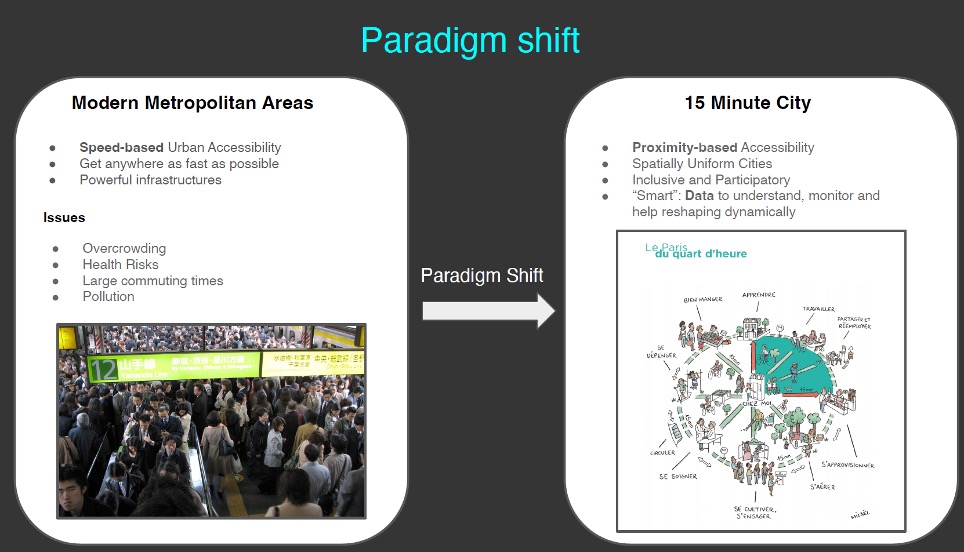
Overcoming chrono-urbanism to plan more equitable cities
Over the last few centuries, humans have developed increasingly faster modes of transport with the aim of reducing travel times. The result? The average duration of daily commutes has increased, and access to essential services within walking distance of one’s home has decreased. In response to this problem, the now popular concept of the 15-minute city has emerged. But is it really time that matters, or is it the opportunities we can access? Vittorio Loreto, director of Sony Computer Science Laboratories in Rome (Sony CSL – Rome), invites us to reflect on overcoming chrono-urbanism. He suggests shifting the focus from proximity to actual accessibility to services, experimenting with practical applications in Rome and other cities around the world to rethink approaches to urban planning. This is also and above all thanks to the support of advanced data and algorithms capable of simulating the redistribution of opportunities, “stealing” services where they are abundant and redistributing them in areas that are poorer in opportunities. Does this remind you of anything? 🏹
Faster, or further?
‘Mobility is the tool we use to satisfy our needs in life, and therefore our desire to access certain types of resources and opportunities.’ This is how Vittorio Loreto, Director of Sony Computer Science Laboratories in Rome, begins his speech.
As mentioned in the introduction, our cities are currently built with a focus on time: the aim is to minimise the time it takes to get from A to B. Yet Italian physicist Cesare Marchetti, with his ‘anthropological invariant’, demonstrated that human beings, everywhere in the world and in all eras, spend on average about an hour a day travelling. This means that although means of transport have evolved over time and become more efficient and, above all, faster, individuals have preferred to travel further rather than spend less time on the same journeys. This constant was identified by Marchetti and confirmed in subsequent studies (e.g. those by Yacov Zahavi on the concept of “mobility time budget”).
Despite this (or precisely because of it), the idea of the “city of proximity” or “15-minute city” has been gaining ground in recent times, aiming to move from the paradigm of speed (“getting everywhere in the shortest possible time”) to that of proximity: ‘The basic idea is to reduce unnecessary or avoidable travel, especially thanks to the spread of essential services to a
Despite this (or precisely because of it), the idea of the “city of proximity” or “15-minute city” has been gaining ground in recent times, aiming to shift from the paradigm of speed (“getting everywhere in the shortest possible time”) to that of proximity: ‘The basic idea is to reduce unnecessary or avoidable travel, especially by making essential services available within a 15-minute walk or cycle’.
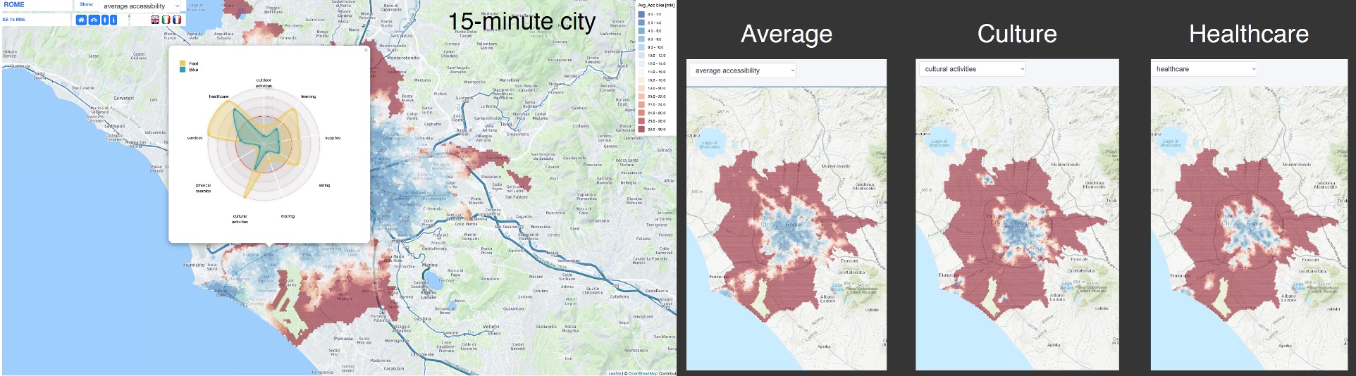
The 15-minute City platform
But how many cities currently meet this approach? Sony CSL-Rome has attempted to answer this question with the 15-Minute City Platform, a freely accessible online platform where users can explore the accessibility of around 10,000 cities, i.e. almost all cities in the world with more than 50,000 inhabitants. The image below shows the example of Rome: blue indicates areas where essential services are accessible in less than 15 minutes; red indicates areas where they are more than 15 minutes away. The height of the columns corresponds to the population living in each hexagon.
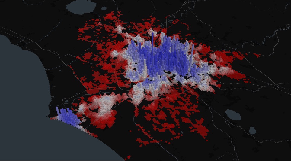
The map clearly shows that accessibility in Rome follows a radial structure from the centre to the suburbs, with the exception of Ostia. “In an ideal 15-minute city, very high hexagons are coloured blue, and low or almost zero hexagons are coloured red. In this sense, it must be admitted that Rome does not perform badly”.
The platform also allows users to investigate access to different service baskets (education, culture, health, etc.) by clicking on a specific point on the map. In this way, it is possible to observe not only how the distribution of different service categories varies in general, but also how they vary within a single area.
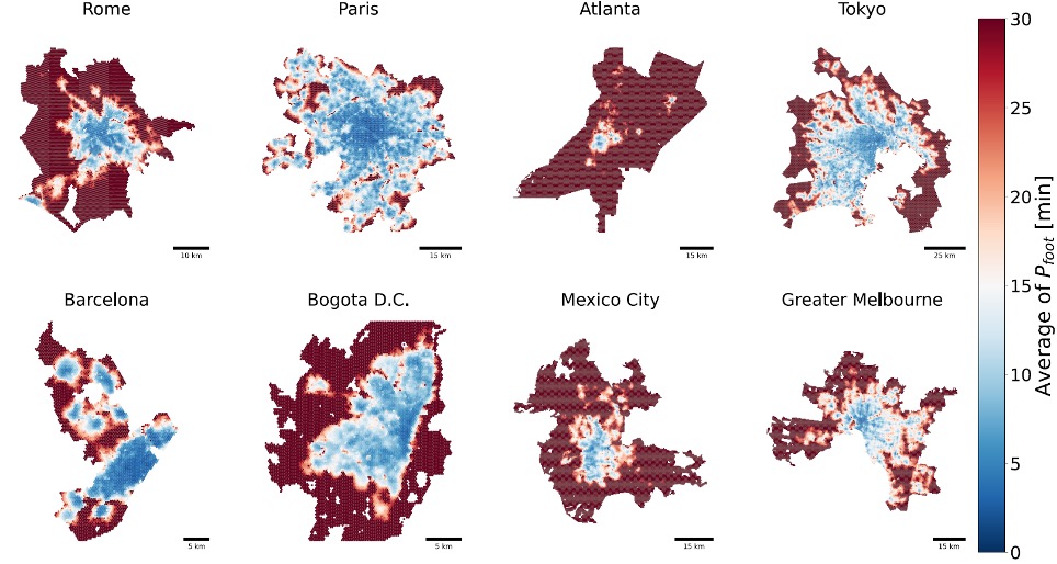
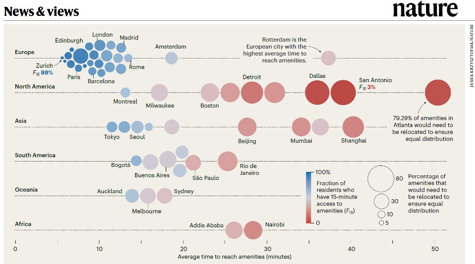
Not only that: stepping back from the details, we can broaden our view and compare accessibility levels with other cities around the world: “This is a very useful exercise for putting things into perspective and gaining an overview of the different ways in which cities are designed”. The example of Atlanta (third from the top in the image below) is very telling with regard to the approach to urban planning and development adopted in the United States, which is clearly different from the European model. In fact, as can be clearly seen in the infographic produced by Nature magazine based on Sony CSL – Rome data, the blue cluster indicating the most “virtuous” cities in terms of accessibility essentially contains all European cities, which share an urban approach already in line with the 15-minute city. In red, on the other hand, are mainly cities on the American and Asian continents, where accessibility is not evenly distributed among the population. ‘This picture reveals great inequality in terms of accessibility: both between cities and between areas within the same city’.
Inaccessibility is inequality
To confirm the correlation between low levels of accessibility and inequality, the accessibility index was compared with the Gini index, one of the most widely recognised and used methods for quantifying inequality in economics and statistics (where 0 means that resources are distributed perfectly evenly across the population, while 1 means that they are held by a single person). The result is a direct correlation: as the average time spent travelling to services increases, so does inequality.
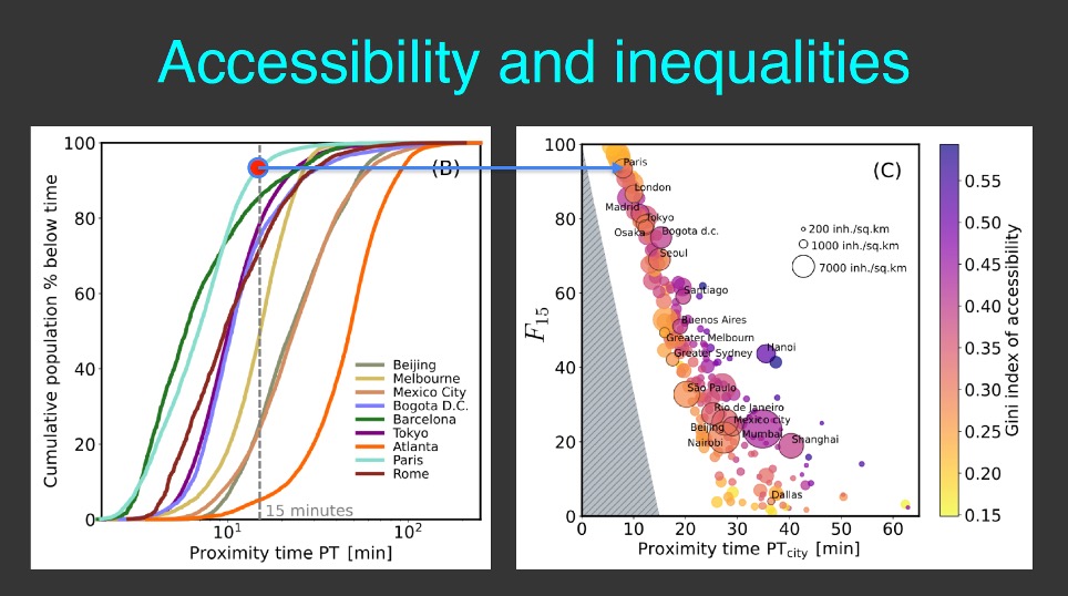
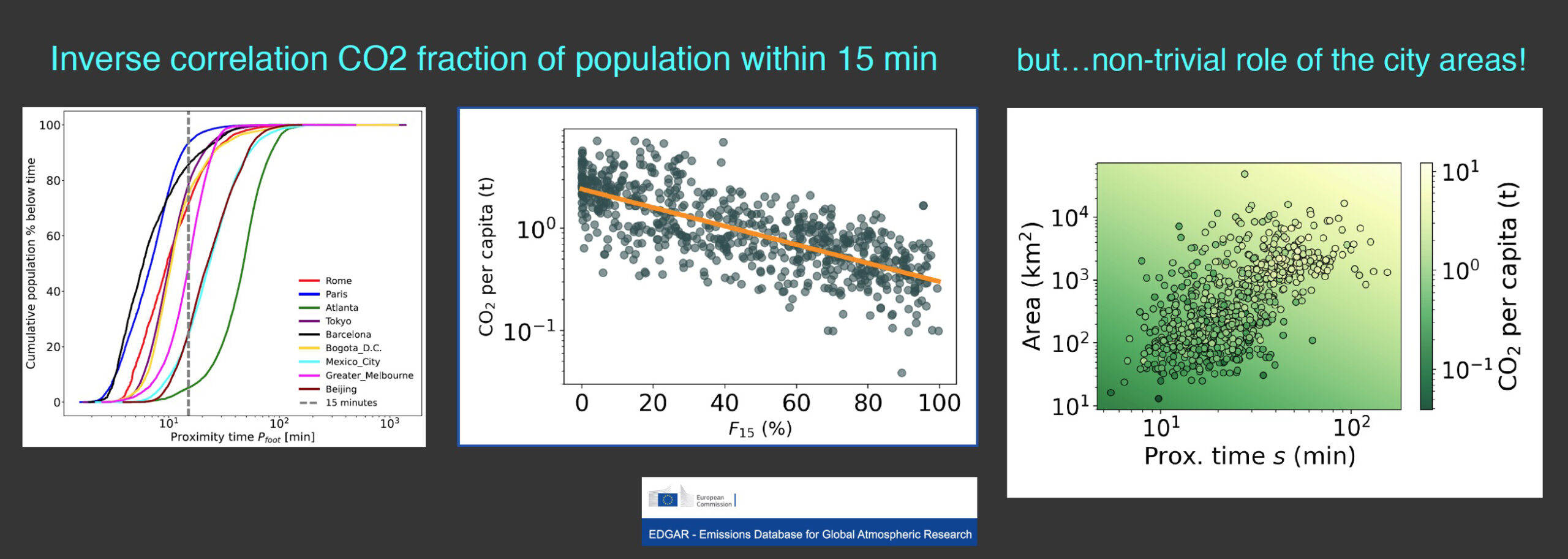
Cities where access to services is more equitable, such as Paris (where approximately 80% of residents have access to services in <15 minutes, compared to approximately 20% in Atlanta), tend to have a lower Gini index (tending towards yellow), thus showing greater equity in the distribution of resources.
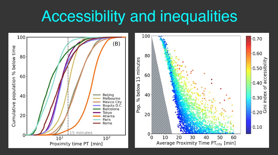
The graph shows that lower inequality (Gini index values closer to zero, in blue) consistently coincides with lower average proximity times, suggesting that greater spatial proximity to services is associated with greater territorial equity.
The Robin Hood algorithm
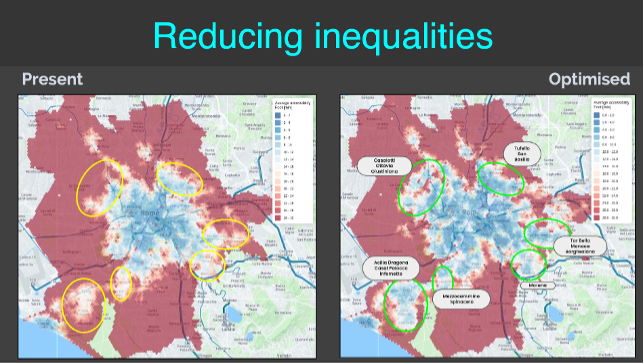
What if we tried to relocate services so that they are more accessible to a larger proportion of the population? This is the question posed by Sony CSL in Rome, which carried out a simulation on Rome. Currently, around 70% of Roman residents already live within a “15-minute city”. If services were redistributed in an optimised manner, this figure would rise to around 90%, reducing inequalities. “This is why we have called this algorithm ‘Robin Hood”: by redistributing the abundance of services in the most central areas, without compromising accessibility, we would improve accessibility in the areas that actually need it’.
And from an environmental point of view, what is the impact of greater proximity to services? Once again, the figures from Sony CSL – Rome show positive results. When comparing walking distance to services and per capita CO₂ emissions, there is an inverse correlation, demonstrating that urban proximity is a key factor in reducing emissions linked to daily mobility. Just think of Paris, which has undergone a radical transformation in recent years by promoting sustainable mobility with substantial investments in active mobility (cycle paths, pedestrian areas) and public transport, halving private car use and achieving a significant reduction in pollutants.
The next image, however, reminds us that proximity to services alone is not enough to explain emissions, because the physical size of the city also comes into play: once again, larger cities tend to have longer average proximity times and are therefore associated with higher emissions.
Is the 15-minute city a universal model?
It is precisely thanks to these simulation exercises that it is possible to realise that the 15-minute model is not applicable to all cities: ‘In many cases, in order to guarantee redistribution, so many services would have to be added that it would not be economically viable’. 15-minute cities work well with a sufficiently high population density. In intermediate areas, which also exist in large cities such as Rome, the model struggles to function: ‘It is unlikely that sparsely populated areas will be filled with services. Proximity is not a solution that can be applied to all cities, sometimes not even to certain areas of the same city. This is why we need to start thinking about additional models’.
The 15-minute city model, in fact, only partially meets the needs of accessibility and urban equity. “First of all, good accessibility does not necessarily mean good quality services. You can live in a city that is perfectly within 15 minutes across its entire area, but with poor services in zone A and excellent services in zone B.”
There are indeed problems related to segregation, because not all areas are covered by good services and not everyone travels in the same way: ‘Mobility patterns depend on gender, age and a wide range of social conditions. Furthermore, the city’s major hubs, such as major monuments, theatres, hospitals, and stadiums, cannot be located in close proximity: we need to find a way to make them more accessible, so as not to isolate people in their neighbourhoods.” So much so that the latter is an element referred to by the various conspiracy-theory ‘dystopias’ that have been evoked around the concept of the 15-minute city, in the fear that it will become a tool of exclusion and segregation.
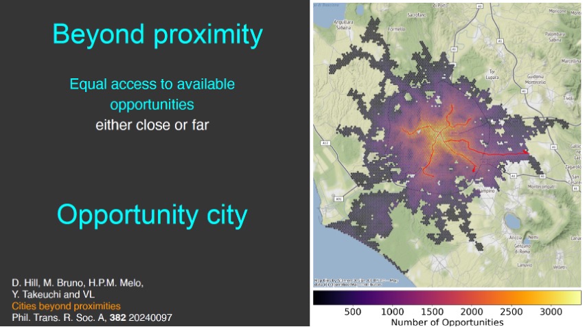
Opportunity is the new Proximity?
There is a possibility to go beyond the 15-minute concept: ‘Perhaps we need to forget about the idea of necessarily minimising time and focus instead on maximising people’s opportunities to access services: leisure, work, health and everything related to a full social life’.
The map below shows the city of Rome: ‘The colours show the opportunities that can be seized from a given area. The fact that the yellow colour (greater opportunities available) essentially follows the underground lines (in red) shows how important mobility infrastructure is in terms of opportunities’.
Opportunities… dependent on the car
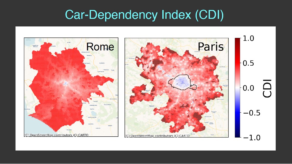
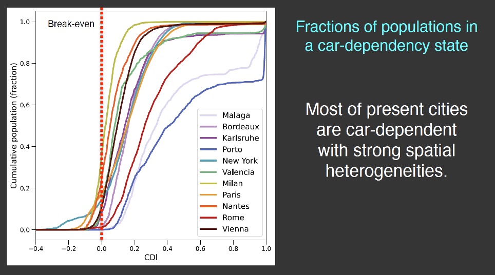
Transport infrastructure is essential, but what happens if opportunities can only be reached by private vehicle? There are areas where access to opportunities depends almost exclusively on the use of one’s own car, causing territorial inequalities. Again, to answer this question, Sony CSL – Rome has prepared an analysis, constructing the Car Dependency Index.
The Car Dependency Index[1] describes how much an area depends on cars to access opportunities: values close to +1 (in red) indicate that almost all services are only accessible by car, while values close to -1 (in blue) indicate that almost all services are accessible by public transport. ‘Data of this kind could be very useful for modelling car use regulation policies tailored to specific areas. For example, penalising private car use in areas well served by alternative means of transport, but justifying it in areas where it is the only way to access services’.
[1] Marzolla, F. (2025) “Models and scenarios for sustainable mobility in cities”, doctoral thesis, Department of Physics, La Sapienza University of Rome.
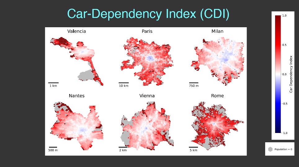
Car dependency is endemic: applying the index to different cities, it can be seen that almost none of those analysed manage to achieve a significant proportion of the population below the threshold (CDI less than zero).
Data-driven compromises
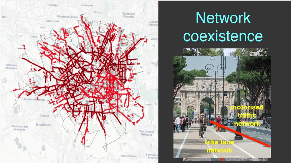
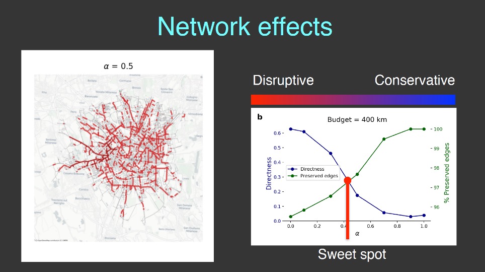
How can we improve access to opportunities in our cities by increasing travel options, while at the same time ensuring that different modes of transport can coexist? Once again, data comes to our aid.
By analysing the network, we can understand how different layers of mobility (active mobility, public transport, private cars, etc.) can coexist. ‘For example, we can study how to build a network of cycle paths on the existing road network, trying to reconcile the need for space for private mobility with the need for cyclists to travel on continuous, direct paths, minimising detours from the most direct route.’ By studying the data, we can find the middle ground between maintaining the status quo and radical change.
Without participation, data remains just numbers
All the examples illustrated show that applying complex network science can yield very important data for efficiently planning urban infrastructure and improving city accessibility. There is no one-size-fits-all solution: the 15-minute city concept has proven to be particularly suitable for high-density areas, revealing the need to go beyond chrono-urbanism and focus on the needs of individuals.
“Infrastructure is very important, but technology alone will not save us”: it is important to focus on studying habits and ways in which they can be changed. This is why participatory processes should be encouraged: “We are used to top-down decision-making processes, delegating people to make decisions for us. In reality, bottom-up decision-making processes work very well, for example for neighbourhood initiatives”. The real problem is how to reconcile the efficiency of small-scale participatory initiatives with larger-scale participatory needs. This is a topic that is currently being researched extensively, and we hope to have results soon so that we can provide cities with the tools to pursue this direction in the best possible way.
VIDEO intervento
Subscribe to our newsletter to follow our activities and access special content.
©2025 GO-Mobility s.r.l. | Partita IVA 11257581006